
My feedback is still same:
1) try it on widescreen, most screens are widescreen and i dont want all vertical space wasted like this
2) you are missing key stuff and your controls are smaller than needed - selections and command menus have more items than can fit there. Player list is missing.
3) Map has to be resizable, map is extremely important and usefull in spring because you can order units there and you see clear icons for unit types.
user interface
Moderator: Content Developer
-
SirArtturi

- Posts: 1164
- Joined: 23 Jan 2008, 18:29
Re: user interface
Yes absolutely, imo. You are heading in right direction.Saktoth wrote:Any feedback on this one?
I think the most important thing is to have a solid boundry between the playspace and the gui space, rather than floating buttons and windows of indefinite length.
What resolution is used on these screens? As licho said, try it with widescreen. I like all of these layouts, only problem as I see it is the positoning of the map, which seems to take biggest space.Saktoth wrote:A collapsible menu may make sense as it 'save space', and making it horizontal may make sense since it is of indeterminate length and you have the most room on the horizontal axis: But it looks terrible, and intrudes raggedly into the playspace. With relatively small icons, we can have more than enough space to list all the options, and we can display build options/orders differentially based on context/tabs.
I think you could have a bit more air with more transparent background color of these boxes. It's too black and its getting heavy for the eye. Sometimes its just a matter of illusion how gui feels even though its taking a lot of space.
Chatbox is logical to have in top of the screen. However, If we would go with "L" shape, like in second screen, you could have pretty nice layout with map on top corner, command menu right below it (maybe you could widen it up and shorten the lenght to make info box to fit in left side also, then dump the chatbox to the bottom, finally break it while make all these solid and seamless as possible. Then some air and right bottom corner the playerlist and top right corner the res bar.
Huh? Why this? Isnt it almost like we have now? Well, That layout works. And imo its most logical to have chatbox and playerlist next to each other. Its efficent and easiest for the eye.
I like it. Blue is pretty safe. It's not necessarily starcraft. Many rts uses blue because its naturally most 'neutral' color. I'd stick with this color until CA has ultimately found its artistic style. Most important thing now is the layout and to make it solid as possible. The style is good too. Maybe needs some polish but cant really say what kind of yet.Saktoth wrote:On colour: I like the blue. Is it too starcraft? I dont know why but i just think it really improves the look of the thing. We might also want to try green, a deeper cyan or turqoise, and teamcolour.
-
SirArtturi
- Posts: 1164
- Joined: 23 Jan 2008, 18:29
Re: user interface
"L" shape also handles the widescreen and resolution problems pretty well. You leave the stuff float to the left and space is added to the right. You got all the command and gameplay stuff on left and all info stuff on bottom. Res bar is good to have clearly separated because when you need to look at it, you shouldnt have any other stuff distracting you. Playerlist imo does not even need frames nor it does not need to be part of the main stuff. minimize option for this could be nice to have...

Re: user interface
Where do other things fit in? The Chicken status thing? The alliance gui? The userlist? Menu bar?
Re: user interface
The GUI should only show information on the first level that you genuinely need to be notified of. Player names dont change over the course of the game, and are displayed in tooltip info anyway (I am not sure that they even should be). Such information should be possible to check if you are curious, but not displayed all the time.
User info should be displayed when you press enter (lichos idea), which will also bring up expanded chat (like LOL does it). Otherwise you will probably just get little lag notification with a teamcoloured icon next to them, afaict thats the only information you really need to notified of, and even then, whats wrong with just pressing enter to check if someone is lagging?
Chicken status should probably be smaller (just showing minimal info, say anger, burrows and tech) and show more in-depth info on click or hover. It can probably go under the resource bar and be simple numbers next to icons.
Ceasefire doesnt need a gui, especially an absurdly bloated one as current. All you need is a simple button next to each players name in the player list, which shows one of four states: Enemies, you are offering ceasefire, he is offering ceasefire, and mutual ceasefire (like OTA did it in the lobby, actually). Clicking it toggles your offer. Team FFA can be handled by having a state icon for each of your allies (teamcoloured) next to each enemies alliance title, and buttons next to each enemy showing their offer state to your team. Ceasefires are handled via consensus vote between each team. Though really, ceasefires are not IMO a core feature and lead to more abuse than anything else. So there is no rush to code this. But it will all show up when you press Enter, and get expanded chat and player info.
Licho is of the opinion that given the horizontal aspect ratios, information should be vertical, along the sides of the screen. I can see the wisdom in this perspective, i can make some mockups of that if its helpful.
Selections can overlap when you have too many of them, like age of empires. Failing that we can have a scroll bar but i dont think its needed (starcraft uses pages). There is enough room for every command in the game (minus, perhaps, the morphs) in the final mockup) the white one). IMO we should go with this approach (square commands area) because then we can put the radial build menu in the same space when you use B or click Build.2) you are missing key stuff and your controls are smaller than needed - selections and command menus have more items than can fit there. Player list is missing.
Granted, so some other element needs to be flexible in size. Probably the info panel.3) Map has to be resizable, map is extremely important and usefull in spring because you can order units there and you see clear icons for unit types.
-
KingRaptor

- Zero-K Developer
- Posts: 838
- Joined: 14 Mar 2007, 03:44
Re: user interface
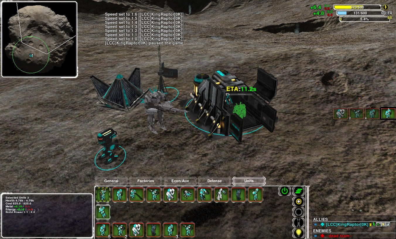
not shooped bitches
