Page 2 of 4
Re: Springlobby connect window improvements
Posted: 06 Jul 2018, 02:30
by gajop
Before we discuss this further, did you consult any existing login forms for games/sites? I'd look at Steam login for one. Generally this isn't something you need to be very creative at.
You made a few images, but i think it's best to talk about just one (universal) version, so I'll look in the first.
Register shouldn't be so awkwardly placed. I'd separate register and login in tabs as those are two different things which require different information.
Show password should not be a checkbox. Either don't implement it, or implement it better, as an element within the pw field for example.
Server isn't that important, and when it is, we want to specify IP and port, so drop-down is not a good UI for it. I'd make it a small text link or button/image. You don't need to handle text links as a http link. Just open something in the editor with it. Clickable text should be an easy thing to do
Re: Springlobby connect window improvements
Posted: 06 Jul 2018, 10:36
by PicassoCT
Save the bureaucratic gasm for after the game
Re: Springlobby connect window improvements
Posted: 10 Jul 2018, 19:14
by ThinkSome
gajop wrote:...
Now I have consulted them. Some do have checkboxes, but for agreements (and websites have remember me as well). However I'm struggling to find some with a show password option implemented.
IP&Port can be specified. It is a combobox+textbox combo as in current Springlobby. Clickable text for what, server? I'll see what can be done. Anyway, latest basic login is here:

- login3basic.png (12.93 KiB) Viewed 5000 times
Re: Springlobby connect window improvements
Posted: 10 Jul 2018, 23:04
by PicassoCT
Archievment undocked

Now, add some fading in battle sound loop to draw players in - and remind them of the spring-lobby starting.

Re: Springlobby connect window improvements
Posted: 11 Jul 2018, 00:51
by gajop
It's getting better but register should not be a button or should be done differently
Re: Springlobby connect window improvements
Posted: 11 Jul 2018, 18:16
by PicassoCT
If you hit login with invalid data/ no data it takes you there?
Re: Springlobby connect window improvements
Posted: 12 Jul 2018, 00:36
by ThinkSome
gajop wrote:It's getting better but register should not be a button or should be done differently
Something like this? However I don't like how wide it is.

- login4basic.png (12.96 KiB) Viewed 4954 times
Should there be a different background than menu grey? Perhaps an image?
Re: Springlobby connect window improvements
Posted: 12 Jul 2018, 14:29
by gajop
"Don't have an account? Click here to register" works but needs proper colors.
It is probably too wide. Consider making the text fields smaller, with more padding on the left and right.
Re: Springlobby connect window improvements
Posted: 12 Jul 2018, 16:09
by abma
"click here" IMHO is very bad style / lang.
https://www.w3.org/QA/Tips/noClickHere
Re: Springlobby connect window improvements
Posted: 12 Jul 2018, 18:34
by ThinkSome
Tell me more about ascending to spring account holder status

- login5basic.png (11.72 KiB) Viewed 4929 times
Re: Springlobby connect window improvements
Posted: 19 Jul 2018, 01:42
by ThinkSome
Unfortunately I don't think implementing it as text link in a cross-platform portable way is possible. So it'll have to stay as a normal button and I'd prefer it at the top with a delimiter instead of below close and login. I also plan to outfit close (red x) and login (green check) with icons, but wxFB does not let me preview that.
Re: Springlobby connect window improvements
Posted: 19 Jul 2018, 01:53
by gajop
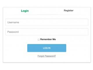
I recommend doing it like this (two tabs at the top), which is what Chobby used originally (and maybe now still, not sure)
Re: Springlobby connect window improvements
Posted: 19 Jul 2018, 11:13
by PicassoCT
I still think this not minimalistic enough..
If a Username is entered - jut check if it exists - and then change the Naming of the button context dependant?
Re: Springlobby connect window improvements
Posted: 19 Jul 2018, 12:58
by MasterBel2
I still think this not minimalistic enough..
I can't tell if Pic is being serious, but I agree.
Re gajop's image:
Why are we giving a "remember me" option? I'd suggest just making it default.
Are we not going to give options to remember/not remember password specifically?
But assuming we're keeping it?
Login looks weird sandwiched between the two buttons. Forgot password is relevant to password, I think, so should be directly under the password? Could we save screen space by putting remember me and login beside each other? Possibly make remember me a green thing that is outline when unchecked and filled in (like the login) when checked?
Or… yes login is the most important button, so make it full width? and then make remember me and forgot password above it on the same line, half width each? Neatens everything up.
We also don't quite want Login to stand out too much more than than the username/password fields, or the Login/register tabs titles? A little but not too much? So reduce it just to an outline possibly, instead of a filled-in shape? Just a random idea…
Edit: Added a wireframe so you can understand where I want to place things? Sketch crashes when I try to add text, so nothing's labeled, sorry. Up top (above the faded line) would be register & login, grey boxes are password & login, orange is forgot password, green is remember password checkbox (the box is where the check would go when ticked, the space is where the text would go), the blue box is the login button. ((I understand spacing & sizing is terrible, this was just a 5 minute job))
Re: Springlobby connect window improvements
Posted: 19 Jul 2018, 13:15
by MasterBel2
((slightly off topic but this seems to assume we'll have a forgot password functionality implemented, I know it's mostly there but just redundantly noting that will have to be worked on too?))
Re: Springlobby connect window improvements
Posted: 19 Jul 2018, 21:25
by ThinkSome
I had planned to remove the remember password option (it would be default) or at least hide it unless lobby is in button lover mode.
As for registration... adding e-mail would add another round of ping-pong with the lobby server plus we'd want captcha or something there as well, to prevent the email field being used for indirect spamming. Therefore I thought about making registration just be a button that opens a registration website in user's default browser. Something that would create a common account shared between lobby, mantis and this forum.
If forgot password were to be implemented, it too would be implemented by a redirect to a website.
Re: Springlobby connect window improvements
Posted: 19 Jul 2018, 22:06
by ThinkSome
MasterBel2 wrote:... Sketch ...
Why not use wxFormBuilder directly? All the screenshots I've pasted so far were of previews in that tool and all of them are contained in the project file:
https://paste.pound-python.org/show/bZM ... MSQOZyf7n/
Save it as ConnectWindow.fbp
Re: Springlobby connect window improvements
Posted: 19 Jul 2018, 23:42
by MasterBel2
Why not use wxFormBuilder directly?
dinna know about that. I'll check it out now, thanks. :)
Re: Springlobby connect window improvements
Posted: 20 Jul 2018, 02:36
by raaar
I dislike the whole "hidden buttons" thing.
"Remember me" seems like a basic option that shouldn't be omitted, ever!
Re: Springlobby connect window improvements
Posted: 20 Jul 2018, 16:31
by ThinkSome
raaar wrote:I dislike the whole "hidden buttons" thing.
"Remember me" seems like a basic option that shouldn't be omitted, ever!
Do you prefer typing in your account name and password every time you connect to the lobby?