Page 17 of 21
Re: Random WIP 2013+
Posted: 29 Sep 2013, 09:53
by Funkencool
I've been playing around with my build/order menu the past day and came up with the idea of separating the two. The order half is still pretty basic, and I'm working on the state cmds right now; but I think I like the basic setup.
Along with that I started on a basic selection info box - and maybe eventually tooltip - to fit with it but haven't got very far on it yet (the one in the corner).


PS. If anyone has or wants to make some icons for BAR that would be pretty neat. Otherwise, I might be finding the time soon..
Re: Random WIP 2013+
Posted: 29 Sep 2013, 12:44
by gajop
Maybe use different backgrounds and unit poses (rotation/scale) for distinct units to better tell them apart?
Re: Random WIP 2013+
Posted: 29 Sep 2013, 13:57
by FireStorm_
ARM Amphibious Complex WIP
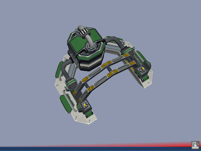
@Funkencool
I like how the build options are horizontally aligned and at the bottom, making them closer to the middle of the screen.
Also I'd try to approximate a movie screen; keep the sides clear as much as possible to generate a bit of a cinematic feel. So I'd move the commands down as well.
Gajop is right I think, though the unit-icons are acceptable to me. The colours are strong though, but work-with/compliment the colours of the command-icons.
If I was to re-do one of 'em, I'd try to keep this colour-relation, but also would try and tone it done. I'd use cooler(and not so much warmer) colours for both types of icons.
I suspect the UI will be customisable up to a point for users. Mainly being able moving boxes about. I think that is a very good thing, but I would create a solid looking UI non the less. I'd try to make it look like a fixed/non-moveable UI maybe with atmospheric hand-painted borders (and then maybe an option to dissolve the borders or un-lock box position.)
So in example: I don't like Warcraft 1&2 UI-scheme these days, but Warcraft 3 kept the sides clear which was a smart step I think. Overall warcraft3 ui-scheme (referring to the cinematic feel) would be excellent in my book if one could click a (sort of go-pro) button making the boxes movable/customisable.
I'm not saying the UI should/must be like this, but just trying to a bit of constructive brainstorming

Re: Random WIP 2013+
Posted: 29 Sep 2013, 15:10
by Beherith
Very nice work! I really like the separation, as it is clear and concise. How did you generate the unit icons? Maybe the unit icons should be team-colored somehow?
EDIT: could you please commit the icon generator you used to /etc/tools?
Re: Random WIP 2013+
Posted: 29 Sep 2013, 18:21
by FireStorm_
ARM T1 Shipyard
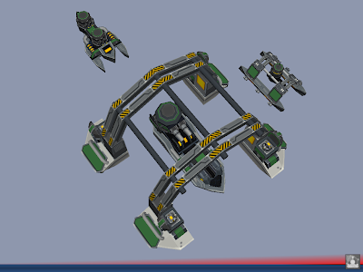
felt like posting another picture
Re: Random WIP 2013+
Posted: 29 Sep 2013, 18:47
by PicassoCT
NAN-dominated Weee I Peeeee

Only Cars are missing
Re: Random WIP 2013+
Posted: 30 Sep 2013, 00:16
by Funkencool
The build icons are mostly just filler, since it only took a few minutes to get some that were at least better than the old ones. The command icons on the other hand are probably going to take a little more time, so I just grabbed some from ZK for now.
@beherith will do, and I have an idea involving an overlay to add specific team color to relevant parts. There might be a better way but I can't think of it.
FireStorm_ wrote:
So in example: I don't like Warcraft 1&2 UI-scheme these days, but Warcraft 3 kept the sides clear which was a smart step I think. Overall warcraft3 ui-scheme (referring to the cinematic feel) would be excellent in my book if one could click a (sort of go-pro) button making the boxes movable/customisable.
My idea was to maybe have multiple solid setups one could switch between. I've seen enough topics about whether a vertical or horizontal setup is best to know people don't agree. So.. I just plan on including both, with maybe some other options.

Re: Random WIP 2013+
Posted: 30 Sep 2013, 01:32
by FireStorm_
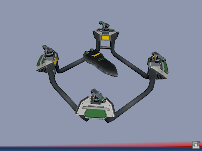
T2 Shipyard
funkencool wrote:
My idea was to maybe have multiple solid setups one could switch between. I've seen enough topics about whether a vertical or horizontal setup is best to know people don't agree. So.. I just plan on including both, with maybe some other options.
Sounds like a good idea
(and I like the setup of that last screenshot, btw, among other things i think it nice the command icons are next to minimap where commands can also be issued.)
Re: Random WIP 2013+
Posted: 30 Sep 2013, 06:33
by Funkencool
Well turns out having team color wasn't nearly as much work as I thought, with a little image processing to make some overlays..

FireStorm_ wrote:
Sounds like a good idea
(and I like the setup of that last screenshot, btw, among other things i think it nice the command icons are next to minimap where commands can also be issued.)
My thoughts exactly.
Also amazing models as usual, I'm sure I'll be seeing a lot more of them when I actually start playing with arm more.
Which reminds me I've been thinking about coming up with two similar but different skins to be the default for each relevant side. For instance something as simple as more beveled corners for the Arm skin. Anyone have any thoughts/suggestions on that?
Re: Random WIP 2013+
Posted: 30 Sep 2013, 07:52
by Beherith
Wow funken, really good work on the teamcolored unit icons!
There was a UI example by Cremuss that would work great for arm, lemme find it...
http://imolarpg.dyndns.org/trac/balatest/changeset/1622
Different skins for the two factions would rock!
FS, I like the t2 shipyard, but its a tad bit more minimalistic than the t1. Would be epic if it showed more flair.
Edit: not a fan of the bottom right minimap btw, its a bit too far from the previous area. Using the movie screen like layout (wider than tall) was my issue with the sc2 and supcom layout as well. Spring generally has left v right and top v bottom battles as well, and using the left bar for UI made it a square-ish play area, which I find to be most fitting.
Re: Random WIP 2013+
Posted: 30 Sep 2013, 08:13
by smoth
behe how will that work when I do the whole addition of themes?
Re: Random WIP 2013+
Posted: 30 Sep 2013, 09:05
by Forboding Angel
New unit for evo:
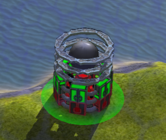
The ball and rings are all animated
Re: Random WIP 2013+
Posted: 30 Sep 2013, 11:50
by FireStorm_
@Picasso
How hard would it be to determine the position of the roads, and use that to only spawn buildings on places that are not road?
Or is that perhaps the next step you're working on?
I assume of course that the town is spawned by code, not placed by hand. If so, could I see some, to ponder about it some more?
@Beherith
That might be a good idea. I thought maybe a crane, or mount the nano's on crane-like things, give it a bit of an oil-rig-fibe to make it seem more lively. I'll see if I can think of something.
Re: Random WIP 2013+
Posted: 02 Oct 2013, 19:01
by AF
@funken which font is that? Is it the final choice?
Re: Random WIP 2013+
Posted: 02 Oct 2013, 19:42
by Funkencool
AF wrote:@firestorm, which font is that? Is it the final choice?
If you were referring to the UI screens and therefore me too. No, not at all and its only on my chili skin not the game. Actually if you have suggestions let me know because I should probably find a better (default) one to work with.
I think the font is UA squared
Re: Random WIP 2013+
Posted: 02 Oct 2013, 21:16
by AF
What're you aiming for? I'd suggest possibly 2 fonts, a standard system/UI font that's plain and reasonable for buttons etc, and a feature font that looks great that appears on larger text.
For example, helvetica segoe futura open sans etc are all generic readable fonts that have no 'association', they're good for general UI as you dont stop to appreciate the finer details of a tiny button or label, you just get on with it and it does the job. Couple that with a feature font that's quirkier for headings/banners/callouts/big text. E.g. a button may use Open Sans but a big marker on the map might use something more exotic like Lobster ( but not lobster, it's overused )
Also you want to make padding consistent around text, don't keep it too close to the edges if you can afford the space. You may decide a single font that's an inbetween works well enough ( do we have multi-font support yet? )
Re: Random WIP 2013+
Posted: 02 Oct 2013, 23:44
by luckywaldo7
Funkencool wrote:Well turns out having team color wasn't nearly as much work as I thought, with a little image processing to make some overlays..
Whoa, so are those build icons automatically team-colored now?
Re: Random WIP 2013+
Posted: 03 Oct 2013, 08:00
by Funkencool
luckywaldo7 wrote:
Whoa, so are those build icons automatically team-colored now?
short answer is yes longer answer is..
I basically just found the difference between one build icon with white team color and one with black team color then saved that as a new overlay image. Lay that over top of a black team color build icon, set the overlay image color accordingly, and you have team colored build icons.
So this way there's two images for every unit but I don't think there's any other way to do it without rendering the build icon in game.
Re: Random WIP 2013+
Posted: 03 Oct 2013, 08:04
by gajop
Smart thinking, GJ.
Re: Random WIP 2013+
Posted: 03 Oct 2013, 10:16
by Beherith
Funkencool wrote:luckywaldo7 wrote:
Whoa, so are those build icons automatically team-colored now?
short answer is yes longer answer is..
I basically just found the difference between one build icon with white team color and one with black team color then saved that as a new overlay image. Lay that over top of a black team color build icon, set the overlay image color accordingly, and you have team colored build icons.
So this way there's two images for every unit but I don't think there's any other way to do it without rendering the build icon in game.
Save team color to alpha and set the glColor and blending mode?