We are highly unlikely to be printing anything, making billboards, badges, letterheads or the like. Thats probably good advice in general, but if you look at, say, the starcraft 2 icon, its this complex metallic stylized letter thing.
Best to fit the medium we are using.
Dont listen to him about 'stark' and 'nihilistic' as long as it looks good, its good. But this is specifically about something thats going to look good as a desktop icon.
ZK Logo
Moderators: MR.D, Moderators

Re: ZK Logo
Blizzard have the money to push through whatever changes they want, and will have a set of alternatives for when it's needed, they're not stupid. You also have to realise that they're stainless steel isn't their logo, it's a special case of their logo.
Eitherway just because my examples don't apply to you directly right now, doesn't mean Im any less right, it just means that the most generic example in the most generic setting doesn't fit the special case logo.
But you should still bare it in mind as it will help with hinge such as making the icon tiny without having to redesign it for 16x16 special case or smaller even. Just because you don't need a flexible logo right now doesn't mean it won't arise later in an unexpected turn of events.
Re: ZK Logo
Well, its actually in the case of 16x16 (which i believe browser icons are) that maackeys logo looks best! But some of the other logos might not scale that well.
Re: ZK Logo
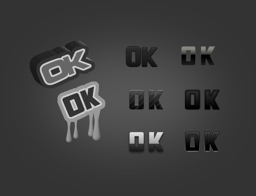
The 0K with the 2 tones modified so that it's based on a version with a dash in the 0 and an outline on the upper half would be the most flexible both in scale colour and the number of modifications, it's easy to remember and can be drawn from memory in seconds, and has a good shape, making it easy to fit in places on banners and adverts and small logos, and it's bold enough to look good filling a whole screenJazcash wrote:

Re: ZK Logo
LOL @ Starcraft 2 Logo...

- Attachments
-
- 0K_8.jpg (11.08 KiB) Viewed 1581 times
Last edited by Sabutai on 01 Aug 2010, 17:00, edited 1 time in total.

Re: ZK Logo
Englishman: "How are your wife and kids?"
Frenchman: "ZE R OK."
Frenchman: "ZE R OK."
-
luckywaldo7
- Posts: 1398
- Joined: 17 Sep 2008, 04:36
Re: ZK Logo
Hell yeah, now thats what I'm talking aboutSabutai wrote:
Last edited by luckywaldo7 on 01 Aug 2010, 17:10, edited 1 time in total.
Re: ZK Logo
ZEROX FTW, BEST SPRING PLAYER
no wait... its zero ok, new pepsi advertise ? zero sugar is ok!
no wait... its zero ok, new pepsi advertise ? zero sugar is ok!

Re: ZK Logo
Hm why arent you guys making this logo more tecnological 


Re: ZK Logo
Pxtl wrote:logo 1 in Scifi's last post FTW.
its still WIP ^^ im hearing lichos ideas on it
Re: ZK Logo
What font is that? looks very starcraft but other than that, nice.
I actually prefer this one:
More understated eclipse.
It could also do with a solid planet though, i think, rather than a cut-out crescent. And its more of a banner or even background than an icon or logo.
I actually prefer this one:
More understated eclipse.
It could also do with a solid planet though, i think, rather than a cut-out crescent. And its more of a banner or even background than an icon or logo.
Re: ZK Logo
THESE LOGOS ARE ZERO OKAY

Re: ZK Logo
nice!! 
the one by satirik on the previous page, and these by scifi, based on it. best!
you could also use satiriks b/w one for "printing" and small versions (16x16), and one of scifis for screenshots, load-screens, web page banner, ...
the one by satirik on the previous page, and these by scifi, based on it. best!
you could also use satiriks b/w one for "printing" and small versions (16x16), and one of scifis for screenshots, load-screens, web page banner, ...
Re: ZK Logo
thanks ill keep trying to add a bit more flavour to it^^
ill make smaler versions
More WIP fun
trying to imitate JKs effect on the sun if you prefer satiriks give me a call


ill make smaler versions
More WIP fun
trying to imitate JKs effect on the sun if you prefer satiriks give me a call
-
SirArtturi

- Posts: 1164
- Joined: 23 Jan 2008, 18:29
Re: ZK Logo
Second and the third (from the first round) looks most professional. The text however could be a bit more improved. The font could be bolder and blended slightly better with the background.
Whatsoever, Imo Zero-K or 0K is just lame name for anything. It does not tell or say anything. It looks stupid and sounds stupid. It's merely a lame noob nickname for a WoW player.

edit:
Now, these latest one I like them all... Now it looks like an ecplise.
Text could be improved though...
Whatsoever, Imo Zero-K or 0K is just lame name for anything. It does not tell or say anything. It looks stupid and sounds stupid. It's merely a lame noob nickname for a WoW player.
edit:
Now, these latest one I like them all... Now it looks like an ecplise.
Text could be improved though...
Last edited by SirArtturi on 02 Aug 2010, 12:59, edited 1 time in total.

Re: ZK Logo
None of these latest logos make physical sense.
1) shows planet in random location
2) shows "empty" space between planet and sun
3) no planet - most ok, could be invisible
4) planet is not a sphere, but should be
1) shows planet in random location
2) shows "empty" space between planet and sun
3) no planet - most ok, could be invisible
4) planet is not a sphere, but should be
Re: ZK Logo
ORLY ???Licho wrote:None of these latest logos make physical sense.
1) shows planet in random location
2) shows "empty" space between planet and sun
3) no planet - most ok, could be invisible
4) planet is not a sphere, but should be