Page 2 of 2
Posted: 31 Aug 2005, 23:25
by Tim Blokdijk
Fox2k, here you go:
(I had to use lowercase, uppercase gave artifacts.)

Do you like it?
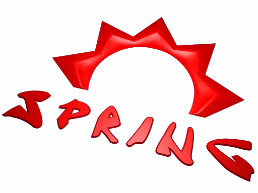
shnorb, alright I will have to redo some of the model to remove some of the shadow, still it's the main reason for me to make a new logo.
Look at that I did not take that long:

Tell me, any better?
As for what 'we' want, I don't know I'm just trying to recreate this in blender:

Anyway, I will finish this thing within 1-2 day's from now.
With that I will release the source file's under the GPL.
Posted: 01 Sep 2005, 00:57
by TA 3D
# 6 is the best looking.
Posted: 01 Sep 2005, 08:46
by shnorb
yeah i think it looks better... ive been looking at them so long i cant tell anymore

Posted: 01 Sep 2005, 13:38
by Fox2k
Fox2k, here you go: (I had to use lowercase, uppercase gave artifacts.)

It seems better, but ... not exactly what I though, it's difficult to find the good one, but thank you for tring it!
I agree the #6 is good too.

And what about the original TA title font ? can we use it? or something similar?

Posted: 01 Sep 2005, 14:40
by SinbadEV
Honestly... all the text is ugly... Maybe you could try building your own 3D letters or something... or use a block font and make it deeper or something
Posted: 03 Sep 2005, 18:56
by Tim Blokdijk
Making a custom font for Spring is a great idea, but as I want to finish it today I will have to settle with the two vote's for #6.
Posted: 03 Sep 2005, 20:55
by Tim Blokdijk
2.5 Final:

Source file:
Released under the GNU GPL version 2.0 or later.
http://www.timblokdijk.nl/spring/logo/logo018.blend
Layer 1: Setup to render above picture.
Layer 2: Source NURBS for the logo.
Layer 3: Source inner ring.
Layer 4: Original 1.0 logo.
Font "jrandomc.pfb" included (GPL) made by
Matt Chisholm.
Background file:
http://www.timblokdijk.nl/spring/logo/redlogo.jpg
Thanks for the feedback and feel free to improve it!
Posted: 03 Sep 2005, 20:59
by Min3mat
me likes!

Posted: 07 Sep 2005, 08:18
by Harm
I prefer minimalistic logos with normal fonts.


