Forum looks bad
Moderator: Moderators

Re: Forum looks bad
That's not new. Firefox & chrome detect `long sentences` and mark them as content, so when the website already starts zoomed out, it will enlarge these parts so that they are still readable. The only way to deactivate that is afaik to use fixed width layout as done on the whole rest of the website. Doing so for the forum can't be done cause the current layout is not small-screen compatible. So to fix that you would have to write a whole new layout. Something I don't plan for short-term.

Re: Forum looks bad
Since a few days (forgot to post it)
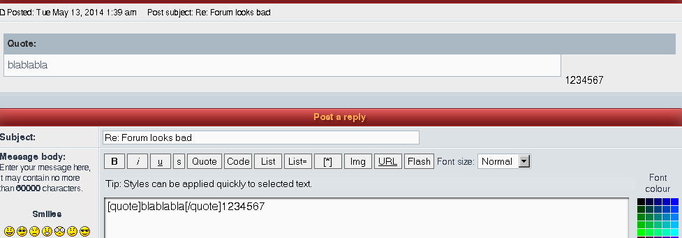
1) quotes look strange when using preview:
http://abload.de/img/blampknf.png
2) Bad/wrong font:

In "Linux" can not see the dot on i etc.
firefox 26.0 (default zoom) on win vista
1) quotes look strange when using preview:
http://abload.de/img/blampknf.png
2) Bad/wrong font:
In "Linux" can not see the dot on i etc.
firefox 26.0 (default zoom) on win vista

Re: Forum looks bad
Font is so bad now.....
The i's look like l's.
The i's look like l's.
-
PepeAmpere

- Posts: 589
- Joined: 03 Jun 2010, 01:28
Re: Forum looks bad
I had same issue in prev iteration. What about font that all web developers use, some standard font... And: jK can make user-profile feature, personalized font for logged user, i think it will be faster done then looking for the holy grail of webmaking - custom font, that is OK for all users.Petah wrote:The i's look like l's.
Re: Forum looks bad
Not a "generic" linux problem. For me Arch (firefox 29), CentOS 6.5 (firefox 26) display fonts nicely (and before the latest change they did the same).knorke wrote:In "Linux" can not see the dot on i etc.
On the other hand, the preview problem I think it was already there even before the latest site change.

Re: Forum looks bad
I disagree, there are other issues, and the main phpbb support forums show none of them
The font on the upload pop up window is also serif default
The font on the upload pop up window is also serif default
- Attachments
-
- Screenshot_2014-05-13-00-56-03.png
- (877.91 KiB) Not downloaded yet
-
- Screenshot_2014-05-13-10-30-29.png
- (320.21 KiB) Not downloaded yet
-
- Screenshot_2014-05-13-10-31-38.png
- (302.16 KiB) Not downloaded yet
Re: Forum looks bad
malric wrote:On the other hand, the preview problem I think it was already there even before the latest site change.
I TELL YOU IT WAS THERE BEFORE, YOU IGNORE ME AND CONTINUE TO BLAME ME.AF wrote:I disagree, there are other issues, and the main phpbb support forums show none of them.
prove that it's NOT MY FAULT:
https://support.mozilla.org/en-US/questions/930928
gajop: edited language
Re: Forum looks bad
Perhaps you should have looked at the screenshots, you forgot the giant quote attributions and the missing font on the upload popup
In the meantime:
Should help with Android chrome, not everyone seeing this is using firefox, and none of my screenshots use firefox ( it isn't installed either ). If the viewport is set appropriately mobile browsers won't attempt to re-adjust font sizes
It also doesn't explain giant text in input boxes
I am simply stating and reporting an issue, not attributing the blame to your first born
In the meantime:
Code: Select all
<meta name="viewport" content="width=device-width, initial-scale=1">It also doesn't explain giant text in input boxes
I am simply stating and reporting an issue, not attributing the blame to your first born
Re: Forum looks bad
IT EXPLAINS IT!AF wrote:Perhaps you should have looked at the screenshots, you forgot the giant quote attributions and the missing font on the upload popup
In the meantime:
Should help with Android chrome, not everyone seeing this is using firefox, and none of my screenshots use firefox ( it isn't installed either ). If the viewport is set appropriately mobile browsers won't attempt to re-adjust font sizesCode: Select all
<meta name="viewport" content="width=device-width, initial-scale=1">
It also doesn't explain giant text in input boxes
Mobile browsers auto enlarge `important` text (as I ALREADY HAVE SAID BEFORE), and there is no transparent standard that says what they resize!
And setting initial zoom doesn't solve anything: it will zoom in as hell , so you don't see anything!
I am open to constructive critics, but you are just blaming and talking down as if you were god.AF wrote:I am simply stating and reporting an issue, not attributing the blame to your first born
Last edited by gajop on 13 May 2014, 13:06, edited 2 times in total.
Reason: edited out aggressive language
Reason: edited out aggressive language
Re: Forum looks bad
I meant the word "Linux" on the screenshot, not the OSmalric wrote:Not a "generic" linux problem. For me Arch (firefox 29), CentOS 6.5 (firefox 26) display fonts nicely (and before the latest change they did the same).knorke wrote:In "Linux" can not see the dot on i etc.
Re: Forum looks bad
Forbodings modded artodia theme works fine on mobiles, and it seems to be the defacto answer in phpbb circles, perhaps we should take a look
Re: Forum looks bad
What about how bad it looks on Chrome desktop (win8)?


Can we not just use Arial/Helvetica?
Can we not just use Arial/Helvetica?
- Attachments
-
- sss2.png (6.23 KiB) Viewed 1969 times
-
- sss.png (8.53 KiB) Viewed 1970 times
-
Forboding Angel

- Evolution RTS Developer
- Posts: 14673
- Joined: 17 Nov 2005, 02:43
Re: Forum looks bad
I suggest that if you are running chrome, to go to the web store and download this plugin: https://chrome.google.com/webstore/deta ... megbdifhlb (I'm sure there is something similar for firefox).
Go to springrts.com, press ctrl+m, and paste this style into the little slide out box.
(including all of the possible weights is technically a bit overkill, but honestly... who cares. It's 1 extra second of loading time once (unless you clear your cache), and these weights are used all over the internet).
gajop: (edited some wording..)
@gajop
I don't know. Ask the person who flushed 6 months of professional grade work down the drain because he didn't understand what he was doing.
Then turn around and ask the other guy why the hell he insists on putting everything in a single database, making it nearly impossible to back up individual parts.
Then please, once these things have been cleared up, come back and tell me more about how I'm being too harsh.
Go to springrts.com, press ctrl+m, and paste this style into the little slide out box.
Code: Select all
@import url(http://fonts.googleapis.com/css?family=Open+Sans:300italic,400italic,600italic,700italic,800italic,400,800,700,600,300);

body {
    font-family: 'Open Sans', sans-serif !important;
}gajop: (edited some wording..)
@gajop
I don't know. Ask the person who flushed 6 months of professional grade work down the drain because he didn't understand what he was doing.
Then turn around and ask the other guy why the hell he insists on putting everything in a single database, making it nearly impossible to back up individual parts.
Then please, once these things have been cleared up, come back and tell me more about how I'm being too harsh.
Last edited by gajop on 14 May 2014, 13:20, edited 2 times in total.
Reason: warning issued: felony 1, 2 and 7
Reason: warning issued: felony 1, 2 and 7
Re: Forum looks bad
Forboding Angel wrote:As much as the engine devs like JK pretend to be, they are not web developers any more than someone who buys a table from Ikea is a manufacturer.
Oh yes, I am no web developer, but I also hardly question you are (you are a web admin maybe, but no web layouter/programmer).Forboding Angel wrote:For those who are tired of font issues and developers who refuse to admit that they know nothing about web development, I suggest that if you are running chrome, to go to the web store and download this plugin: https://chrome.google.com/webstore/deta ... megbdifhlb (I'm sure there is something similar for firefox).
Go to springrts.com, press ctrl+m, and paste this style into the little slide out box.
(including all of the possible weights is technically a bit overkill, but honestly... who cares. It's 1 extra second of loading time once (unless you clear your cache), and these weights are used all over the internet).Code: Select all
@import url(http://fonts.googleapis.com/css?family=Open+Sans:300italic,400italic,600italic,700italic,800italic,400,800,700,600,300);

body {
    font-family: 'Open Sans', sans-serif !important;
}
Why I say so? Cause your advised fix WON'T WORK, see: http://stackoverflow.com/questions/1148 ... gle-chrome
(google's own webfonts suffer the same render problem!)
Re: Forum looks bad
This thread is becoming personal too fast. If you guys can't communicate problems in a polite and respectful way I'll have to ask you to refrain from posting entirely.
Open new threads IFF you can post criticism while following the forum rules.
PS: For reference, take a look at AF, pepe and other posters here. You can be civil while also giving constructive criticism.
Open new threads IFF you can post criticism while following the forum rules.
PS: For reference, take a look at AF, pepe and other posters here. You can be civil while also giving constructive criticism.