P.U.R.E. 0.8 RC3
Moderators: Moderators, Content Developer
Re: P.U.R.E. 0.8 RC3
Gnomre some people do no understand what or how dsl works.
Re: P.U.R.E. 0.8 RC3
I guess Gnome got up on the wrong side of the bed this morning 
Meh, I just wanted to show some pretty screenshots, and they're over 500KB in total size, I thought fair warning for people with DSL caps or low bandwidth was appropriate, myself. Not everybody has true broadband, my folks are lucky if they get 30KB / second downstream.
Meh, I just wanted to show some pretty screenshots, and they're over 500KB in total size, I thought fair warning for people with DSL caps or low bandwidth was appropriate, myself. Not everybody has true broadband, my folks are lucky if they get 30KB / second downstream.
Last edited by Argh on 16 Feb 2009, 23:33, edited 1 time in total.
Re: P.U.R.E. 0.8 RC3
eh, low end dsl is not dialup man.
Re: P.U.R.E. 0.8 RC3
No, it's not. But it's not worth trolling my thread over, either way.
Re: P.U.R.E. 0.8 RC3
I don't think gnomre meant to troll man. Although I almost put a pun into this post because of the new unit name.
Re: P.U.R.E. 0.8 RC3
I wasn't trying to troll but you did sound a lot like a comcast commercial there
Re: P.U.R.E. 0.8 RC3
Need more variation in houses/trees/features in general. I mean it looks nice, but also quite boring.
Once classes are over I'd like to learn how to UVmap and texture so I can maybe make some environmental features, seems quite lacking there
Once classes are over I'd like to learn how to UVmap and texture so I can maybe make some environmental features, seems quite lacking there
Re: P.U.R.E. 0.8 RC3
Hey, the more the merrier. Main reason I haven't gotten to more variation is that I've had a lot of work to do on code-related work lately.
Re: P.U.R.E. 0.8 RC3
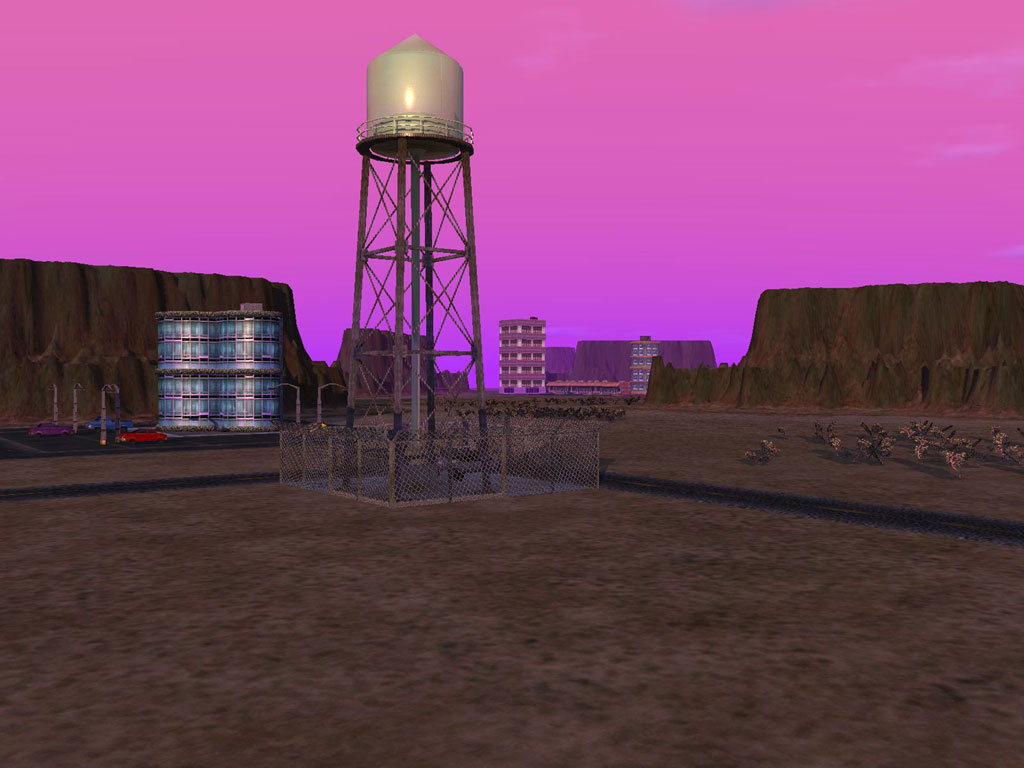
The town and buildings and houses and parked car look very fine. But it makes the glowing ressource cube and sphere not fit well in the setting: on one hand you've got like a very detailed replica of a 20th town, and then magical floating thing that looks like game bonus and not at all like actual urban furniture. So I suggest finding a way to make the ressource orb and cube look like less game bonus and more like something you could find in a city. For a quick first step, could be just adding a stand and making them standing less askew.
Re: P.U.R.E. 0.8 RC3
You obviously haven't played the game, lol.
Re: P.U.R.E. 0.8 RC3
I played RC3, which afaik is the lastest public release.
It had the ressource orb and cube, but not the town.
It had the ressource orb and cube, but not the town.
Re: P.U.R.E. 0.8 RC3
And the cube / ball are closed, and basically aren't that flashy, when they haven't been activated.
Seriously... I've thought about making them look more "normal", but I'm afraid if I do, nubs won't be able to figure things out very easily. The new resource system is, if anything, more complex than the old one, so it's pretty important that people know what to hunt for visually. I'll keep that under advisement, though, I just haven't had time to seriously consider rebuilding the models or their animation sequences lately.
Seriously... I've thought about making them look more "normal", but I'm afraid if I do, nubs won't be able to figure things out very easily. The new resource system is, if anything, more complex than the old one, so it's pretty important that people know what to hunt for visually. I'll keep that under advisement, though, I just haven't had time to seriously consider rebuilding the models or their animation sequences lately.
- Guessmyname
- Posts: 3301
- Joined: 28 Apr 2005, 21:07
Re: P.U.R.E. 0.8 RC3
I would seriously consider adding bases underneath or platforms on the ground where those things are floating. There is still the user convention problem with cubes and spheres and I would suggest reversing it so they're open and close when captured rather than being closed and opening when captured. This would make it more obvious to first time users that these are 'special' and need to be sought after.
The platforms if given a team colour would also help identify which team has captured said resource point.
I would also make them pulsate and glow when at strategic zoom distances to make them more obvious. Last time I played when they went out of los they became ghosts and where 10x harder to spot as a result, it was extremely frustrating yet so easy to fix.
- clericvash
- Posts: 1394
- Joined: 05 Oct 2004, 01:05
Re: P.U.R.E. 0.8 RC3
That defeats the whole point of them being floating objects...AF wrote:I would seriously consider adding bases underneath or platforms on the ground where those things are floating.
Re: P.U.R.E. 0.8 RC3
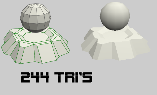
A model I made 6 months ago disagrees with you:


- clericvash
- Posts: 1394
- Joined: 05 Oct 2004, 01:05
Re: P.U.R.E. 0.8 RC3
Well i don't like the base i think they look fine how they are, they are meant to stand out.
- Evil4Zerggin
- Posts: 557
- Joined: 16 May 2007, 06:34
Re: P.U.R.E. 0.8 RC3
A base helps emphasize that the floating object is static (apart from perhaps some minor wobbling). Although I haven't played the mod so I don't know if this is desirable.
... fuck Comcast. That is all.Gnome wrote:Then again it doesn't take much to cockslap comcast these days
Re: P.U.R.E. 0.8 RC3
Doesn't have to be as big as that one, it could be a ground decal even. But right now the resources are represented wierldly, and defy cultural convention. We all have played the game and thus have prior experience but new users do not have this. This is quite a serious game play flaw that is being overlooked because of our personal familiarity.
Look at it this way:
Cultural convention says blue for energy/electricity
P.U.R.E says blue for materials
Cultural convention says red orange for fire
P.U.R.E says red orange for energy
see the mismatch? The two cultural conventions where swapped for P.U.R.E!!!! Conventions that even go into the other spring games and other games outside our community. It goes even further!
An open moving glowing cube suggests the cube is active (when actually its idle and inert) and a closed static cube suggests its inert (when actually its now active and generating energy!). the same for the spheres.
This defies a basic human association of static/inert/immobile and active/moving/energetic. An inactive cube should be inactive, and an active cube active, and what does a cube do when active? It generates energy!!! No materials, see I'm already making mistakes!!
Why learn an artificial mapping as an exception to a fundamental rule that pervades our culture to make things harder and give users something to learn when you can rely on pre-existing things that the user already knows that are everywhere.
On top of that, the very notion of cube versus sphere. Most people assume a resource producing dome or sphere will be a power plant because that's what power plants usually have inside them. Reactor cores usually tend to be circular in some way in the common perception.
My fix:
Swap the cubes and the spheres purpose. Make the spheres generate power and the cubes generate material, and swap the colours.


