P.U.R.E. 0.55
Moderators: Moderators, Content Developer
-
clericvash

- Posts: 1394
- Joined: 05 Oct 2004, 01:05
Re: P.U.R.E. 0.55
Maybe have it semi transparent when units are not selected, so you know whos units are whos.

Re: P.U.R.E. 0.55
That's a good idea- cut down the alpha levels quite a lot for stuff that isn't selected. I'll do that.Maybe have it semi transparent when units are not selected, so you know whos units are whos.
Well, basically, I wanted to solve the "I can't see my soldiers" problem that beta-testers reported, when zoomed out. The Resistance troops are quite small, and that makes them a bit hard to see against a terrain, no matter how much teamcolor I put on them (I tried teamcolor on the helmets, etc., but it just looked horrible, tbh).Looks cool too, having constantly glowing units sounds a bit wierd in theory but I reckon this would look quite nice and be very practical once you got used to it.
I've already written the option to do either selected or all the time, and they'll cancel each other out, so that you can't accidentally activate both at once. As I said, that was trivial, and gives people a choice. And of course, people can turn this stuff completely off, if they wanna.
The next thing on my list is a new way of displaying unit health / build-status, etc., that I've been thinking about for awhile.
-
Forboding Angel

- Evolution RTS Developer
- Posts: 14673
- Joined: 17 Nov 2005, 02:43
Re: P.U.R.E. 0.55
Excellent work argh. Looking very spiffy. I'm glad you took the time to look into that code for me, cause I was really hoping to see it in pure.
/me does happiiiee dance
And yes, lot of transparency on units not selected would be 100% JAWSOME.
/me does happiiiee dance
And yes, lot of transparency on units not selected would be 100% JAWSOME.
Re: P.U.R.E. 0.55
For the record, that's not "that code" at all. I did a complete re-write from scratch, after playing with it a bit and realizing that it was never going to be satisfactory.I'm glad you took the time to look into that code for me, cause I was really hoping to see it in pure.
-
Forboding Angel
- Evolution RTS Developer
- Posts: 14673
- Joined: 17 Nov 2005, 02:43
Re: P.U.R.E. 0.55
Hey, that's fine with me  Nice to see it done better-er from the get go tbh.
-
clericvash
- Posts: 1394
- Joined: 05 Oct 2004, 01:05
Re: P.U.R.E. 0.55
Woo you are using one of my ideas, i rule lol, and i will feel just that bit more cool when i play it lmao.
-
Google_Frog
- Moderator
- Posts: 2464
- Joined: 12 Oct 2007, 09:24
Re: P.U.R.E. 0.55
Could you make the resource bar display input and output not just net gain? Net gain isn't particularly useful because there's no way to see what level your economy is at and if both E and M are being stalled you can't see which one is being stalled the most.
-
1v0ry_k1ng

- Posts: 4656
- Joined: 10 Mar 2006, 10:24
Re: P.U.R.E. 0.55
that looks pretty damn sweet
when the balance tests begin i reckon you want to start small and make sure combat shells/resistance infantry combat is interesting and fun, then build up from there. in the last publicly released version combat shells were absolutely useless.
when the balance tests begin i reckon you want to start small and make sure combat shells/resistance infantry combat is interesting and fun, then build up from there. in the last publicly released version combat shells were absolutely useless.

Re: P.U.R.E. 0.55
omg I did not know this, please fixGoogle_Frog wrote:Could you make the resource bar display input and output not just net gain? Net gain isn't particularly useful because there's no way to see what level your economy is at and if both E and M are being stalled you can't see which one is being stalled the most.

Re: P.U.R.E. 0.55
With that huge res bar I was expecting a list so detailled that you can see production by unit type...
Re: P.U.R.E. 0.55
Done, it's in the next beta. Sorry, I just plain forgot about it, adding it was trivial. Now it displays net and real income like this: -10 / 100, so that you know that you're using 110, for example.Could you make the resource bar display input and output not just net gain? Net gain isn't particularly useful because there's no way to see what level your economy is at and if both E and M are being stalled you can't see which one is being stalled the most.
Also about halfway done with a new way of showing unit status- health, build, etc., using some new ideas. I could show a screen, but it still looks pretty crude atm. When it's presentable, I'll put up some shots.
Re: P.U.R.E. 0.55
P.U.R.E. RC1 has been sent to the beta-testers.
Oh, and 1v0ry_k1ng... you are being sent this beta. Have fun, and send me feedback.
Oh, and 1v0ry_k1ng... you are being sent this beta. Have fun, and send me feedback.
Re: P.U.R.E. 0.55
Got a new feature done today- a different way of displaying unit status.
There are a lot of different ways to skin this cat, of course. I tried doing some fancy texture-coordinate stuff and some other things, and it looked awesome up close, but terrible at a distance.
So, long story short, after a lot of experimentation, I settled on this:
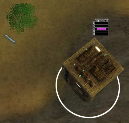
Up close.
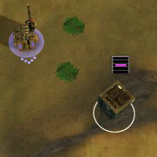
Far away.
Both shots are at actual testing resolution, and like most things in my UI, it all sizes dynamically. So it's not huge, even if you're at a lower resolution, basically.
There are a lot of different ways to skin this cat, of course. I tried doing some fancy texture-coordinate stuff and some other things, and it looked awesome up close, but terrible at a distance.
So, long story short, after a lot of experimentation, I settled on this:
Up close.
Far away.
Both shots are at actual testing resolution, and like most things in my UI, it all sizes dynamically. So it's not huge, even if you're at a lower resolution, basically.
Re: P.U.R.E. 0.55
What do the little letters mean? Where possible could you replace them with symbols so no explanation is required?
-
clericvash
- Posts: 1394
- Joined: 05 Oct 2004, 01:05
Re: P.U.R.E. 0.55
To be honest i don't really like that way of display it.
-
Guessmyname

- Posts: 3301
- Joined: 28 Apr 2005, 21:07
Re: P.U.R.E. 0.55
If you made the bars 2-3 times wider, that would be better. Given that they provide info at a glance, the wider the bar the more accurate the information it can give you
-
Warlord Zsinj
- Imperial Winter Developer
- Posts: 3742
- Joined: 24 Aug 2004, 08:59
Re: P.U.R.E. 0.55
I'd also say that from a minimalist point of view, you don't need the 'status' text there, as it's self-evident, and just taking up space.
Re: P.U.R.E. 0.55
I would suggest onyl showing those bars thata re relevant, such as only showing construction or capture when there si an ongoing process that has started. But I know you prefer strict rigid GUIs Argh. For an example of what I mean look at JKs health bar widget which only shows certain bars within the right context so as nto to clutter the screen with unnecessary bars.
Re: P.U.R.E. 0.55
I can hardly read the text on your info panel. White on gray isn't the best idea.
Re: P.U.R.E. 0.55
I'll fix the contrast and ditch the letters, and go for a symbolic approach (little "jewel" boxes with differentiated color ranges), and make the bars as wide as will fit into the native resolution of the background- those are all good ideas. Lemme get that done and re-code the spacing, etc, and see how it feels.