Fusion balls look really great.
Models look awesome, even better than I expected.
The overall problem is, as regret mentioned, that there is too much teamcolor. It makes the models look a bit too generic & blurry.
Bob, you said you envisioned core as a 'red' colored faction, now thats a bit fail designwise: While gray and red matches great in contrast, the blue makes it too dull. It's simple color theory.
Imo you could rudely reduce the teamcolor texture by half and replace that half with something more specific and detailed, not gray colored. That would get rid of the blurry effect on different team colors than red.
BA model replacements
Moderator: Content Developer

Re: BA model replacements
I think it looks fine. Green etc will alll look good. He is just doing red and blue ad the basic colors. honestly, I do like a maroon  .
.
-
SirArtturi

- Posts: 1164
- Joined: 23 Jan 2008, 18:29
Re: BA model replacements
Basically everything here have been fine for you, so ignore smoth, he just wants to over-encourage.
I'm trying to be honestly constructive here.
I'm trying to be honestly constructive here.
Re: BA model replacements
No, I am saying that anything you chose could cause visual confusion with regards to colors. Say adding a secondary brown? Ok then lets say arm gets secondary light blue... well
so we have a core player grey and brown teamcolor light blue. We have arm player grey and blue team color brown...
you see my thought on that?
It would need to be more than just hue.
say like
halo:
Green(humans)
vs
blue-purple pearlescent(covenant)
Starcraft:
Gold(protoss
vs
grey(terran
vs
fleshy orange(zerg
CNC
BLACK(nod

VS
TAN(gdi
I think grey can go really well All that is needed are a few areas where you add some more contrast.
or it can go really badly

I think bob's stuff looks good. I am not dismissing anything I just didn't feel like typing a whole godamn post. Happy arturri?
so we have a core player grey and brown teamcolor light blue. We have arm player grey and blue team color brown...
you see my thought on that?
It would need to be more than just hue.
say like
halo:
Green(humans)
vs
blue-purple pearlescent(covenant)
Starcraft:
Gold(protoss
vs
grey(terran
vs
fleshy orange(zerg
CNC
BLACK(nod
VS
TAN(gdi
I think grey can go really well All that is needed are a few areas where you add some more contrast.
or it can go really badly
I think bob's stuff looks good. I am not dismissing anything I just didn't feel like typing a whole godamn post. Happy arturri?
-
SirArtturi
- Posts: 1164
- Joined: 23 Jan 2008, 18:29
Re: BA model replacements
This is basically what I was after.smoth wrote:
I think grey can go really well All that is needed are a few areas where you add some more contrast.
It's not completely about different hues. Its about contrasts and details aswell.
Also, models that are dependant of huge amounts of teamcolor plates, usually can fail with some colors more than ones that has not so much teamcolor. That's why regret had a point there.
For example, the metal storage (if im right) in the blue teamcolor picture is a bit bland compared to, lets say, to airpad, because the airpad (1) has much less teamcolor (2) on the contrary more intense contrasts and different hues of gray (between black and white)
Thanks, I understood you now.smoth wrote: I think bob's stuff looks good. I am not dismissing anything I just didn't feel like typing a whole godamn post. Happy arturri?

Re: BA model replacements
Remember that we are modeling these to be distinguishable from a distance as well. The contrast between color and gray is one of the only reasons you can actually see it from the normal camera distance, and know what it is. Its the warhammer 40k effect. And, if you compare it to a game like dawn of war, there isn't near that much TC anyway.The overall problem is, as regret mentioned, that there is too much teamcolor. It makes the models look a bit too generic & blurry.
The only other option to keep the contrast so vivid, is to lower the tc and create another color tone. Frankly though, dual color tones wouldn't really work with the gray we have now. Also, that would mean rewrapping all of them.
Regardless of blue or red, I can still distinguish between models fairly easily without even expanding the images behe gave us. So I know its doing its job.
Be careful not to fall into the trap the CA models did. (I dont know who made those, and Im sorry if Im stepping on someone's toes here.) They look great up close, but frankly, abysmally messy from a distance. We are trying to make sure that doesn't happen, and instead use an art style that is conducive of spammability. I think we should leave it alone for now, and see what happens when they are all done and finished with units.
And yes, I know (before someone says it) that the amount of TC makes the models look somewhat cartoony. Cartoony in a rugged sort of way. As blasphemous as it may sound, I think this is a good thing. Realism and spammability have a hard time coexisting. Especially when there is such a great number of models. A good example of cartoony vs ultra realism would be supreme commander vs supreme commander 2. Its obvious the art in supcom 2 was far more distinguishable and memorable than the messy/blurry ones from supcom 1. Obviously, cartoony doesn't have to mean excessive cell shading and ridiculous proportions, just more colorful than average stuff with slightly unnecessary designs.
Lastly, don't underestimate the power of AO ground plates. As AO plates tend to sort of highlight the model when zoomed out, thus you have a base shape recognition element too.
Gah..now I feel like the "dismiss everything" modeler... D: Oh well. Rest assured I'm trying my best to read all of the suggestions.

Re: BA model replacements
Bob put this much more eloquently then I ever could. I feel the after staring at the models in game for quite a while is that they are more than stunning. Even while keeping in mind that they all share a relatively small base texture.
Artturi, if you look at that model you posted, its obvious it has at least a 512*512 custom texture (i'm pretty sure its 1024 though). There is no way Bob and Pyra could ever attain this remarkable throughput while making custom textures for each model, while not even taking into account the ridiculous texture space explosion that would result from each model having its own at least 512 sized texture.
The UV wrapping techniques and modeling tricks used to by Bob and Pyra to create these models fall nothing short of mind boggling, all while retaining the very high performance that is essential to this game (texture switching is expensive, and a shared texture space is probably the best optimization in a game that uses this many different models).
Old BA models look like a jumble of random textures, with odd noisy bits thrown in at will. The fact that Bob's current texture is the same sized as the entire BA atlas, while looking far superior - without any sense of repetition or tiling on the models - is a feat I have yet to fully grasp.
Edit: What many of you are mistaking for 'sharpness' in the BA textures is the fact that the engine does nearest neighbour filtering when doing texture lookups on atlassed 3do models, thus resulting in a false sharpness and contrast appearance resulting from seeing moire patterns.
For the record, I do not feel there is too much team color on the models, the balance of metal and team color patterns help a lot in distinguishing models from a distance.
-
SirArtturi
- Posts: 1164
- Joined: 23 Jan 2008, 18:29
Re: BA model replacements
No no bob, I think you are missing my point. I'm not talking about adding an additional color. I was talking about adding more depth to the textures and getting rid of the excessive teamcolor that blurs, not distinguishes.
Im not a modeller, and not a textures, but as I see it, It would mean couple more extra texture blocks(Some specific and characteristic ones) and rewrapping of those. Could be a painful job? Worth it, not sure...
Hard to describe what I mean since im not a expert in this at any scale. I'm just trying to be constructive in aesthetical sense and thus be silent for now.

Re: BA model replacements
Well to be fair, the teamcoloring just kinda exploded in my face!
But... I think that is mainly due to its luminescence. Make it a bit darker and maybe it looks already a lot more at ease. The red color looks also better than the blue one cause it is a little darker.
Just my 2 cents.
Gr8 work, they look amazing nonetheless!
But... I think that is mainly due to its luminescence. Make it a bit darker and maybe it looks already a lot more at ease. The red color looks also better than the blue one cause it is a little darker.
Just my 2 cents.
Gr8 work, they look amazing nonetheless!
Re: BA model replacements
he is using bright red and blue. Those are good teamcolor texture channels because they are showing that clearly. if you want a not bight teamcolor you would choose one. If he mutes the teamcolors then a player choosing a teamcolor will not get the color he chooses.
Re: BA model replacements

I did some muted colors for you and here is a png as i found the jpgs to muddy up the image.
Re: BA model replacements
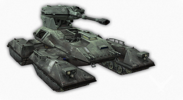
I take it you guys like the intimidator model. :3
EDIT: Also, if you want less bright tc, just pick the same color with lower brightness and less saturation. Personally, I like the bright blue/green/red colors. (Bright as in 255, 0, 0)
EDIT: Also, if you want less bright tc, just pick the same color with lower brightness and less saturation. Personally, I like the bright blue/green/red colors. (Bright as in 255, 0, 0)
-
luckywaldo7
- Posts: 1398
- Joined: 17 Sep 2008, 04:36
Re: BA model replacements
I love all of them. They look great and I think you still managed to capture the spirit of the originals.
Re: BA model replacements
bob, it is because it is the unit name I know. Also helping behe sort the texture 1 and 2.

you can make out the dust and scratches now. Next is the texture 2. wish me luck ya'll
you can make out the dust and scratches now. Next is the texture 2. wish me luck ya'll
Re: BA model replacements
Oh and one thing I wanted to address, even though its kind of early, is the shield effect. Frankly the current one is pretty bad. Would it be possible to just make a huge sphere of distortion similar to the spheres for the fusions? But, ofc, just make it more transparent. (Less distorted. So you can see through roughly.)
EDIT: This is directed at everyone btw.
EDIT: This is directed at everyone btw.
Last edited by Mr. Bob on 21 Mar 2011, 04:39, edited 1 time in total.
Re: BA model replacements
I am not the guy to talk to about sfx, I don't really know that stuff.
ok, texture 1&2 done. I think it looks tons better
 click for larger picture
ok, texture 1&2 done. I think it looks tons better
click for larger pictureRe: BA model replacements
Looks great! Now try it with the normal map. :D
Re: BA model replacements
I've no idea how to tweak the normal map but I can give you a shot of them with the current normal map +tweaks.

Re: BA model replacements
sexy stuff bob.
whats wrong with current shield effect ? its ok for me :D
@ ak - looks too bulky for a shitty hp unit. reduce size of the torso. faces will be smaller and look less boring and empty.
whats wrong with current shield effect ? its ok for me :D
@ ak - looks too bulky for a shitty hp unit. reduce size of the torso. faces will be smaller and look less boring and empty.

Re: BA model replacements
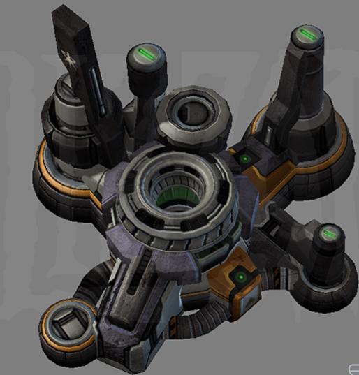
I think radar should be double-sided
- Attachments
-
- radar.jpg (45.83 KiB) Viewed 2691 times