It took half a year or so.. but in the meantime I took a 16 hour Blender training from
Dolf "Macouno" Veenvliet, a real official Blender Foundation Certified Trainer. Whooo!!
Technically I understand Blender
a lot better, still need another training to become more creative.

I mainly tried to push that CRT idea. I have a scanline effect now unfortunately it's not visible on scaled down renders. Also added a little displacement to the excising lens distortion. And the alpha channel is working correct now.
The compositor had a bit more complexity added, still each node has its purpose so I can't simplify it.
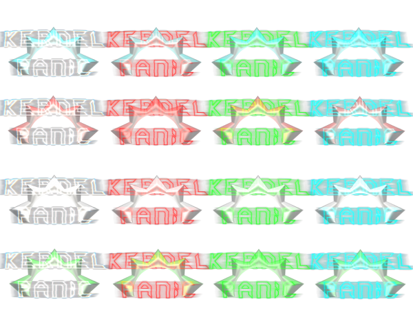
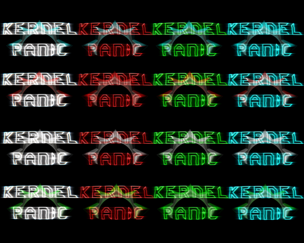
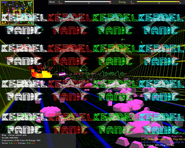
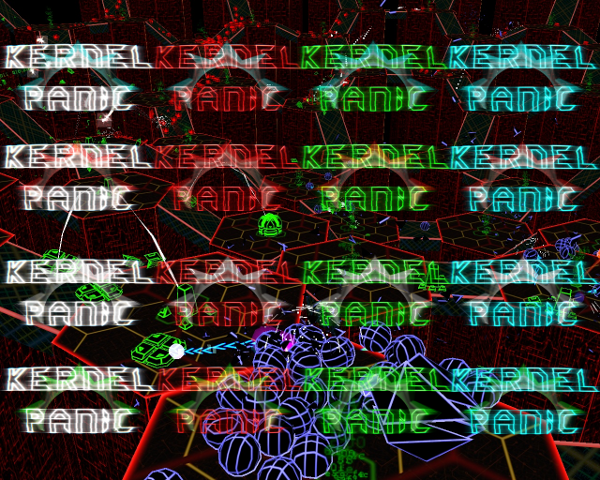
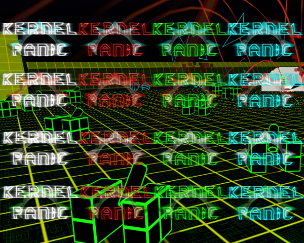
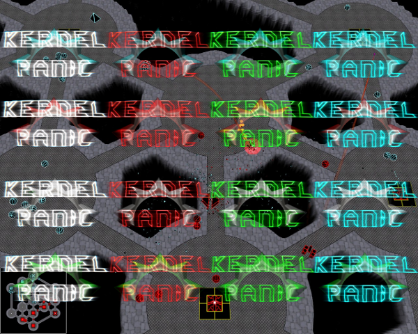
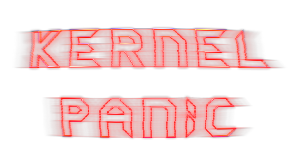
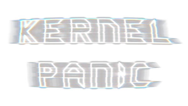
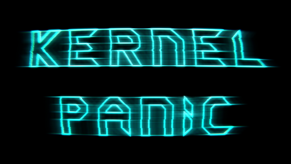
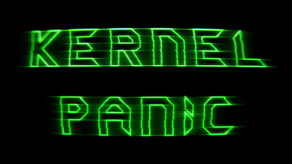
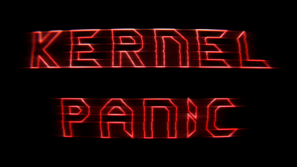
Anyway's.. let me start with the different colours, I really don't know what combination would be good. Decided to pick four basic colours and mix them. (click for bigger picture)
Transparent background:
Black background:
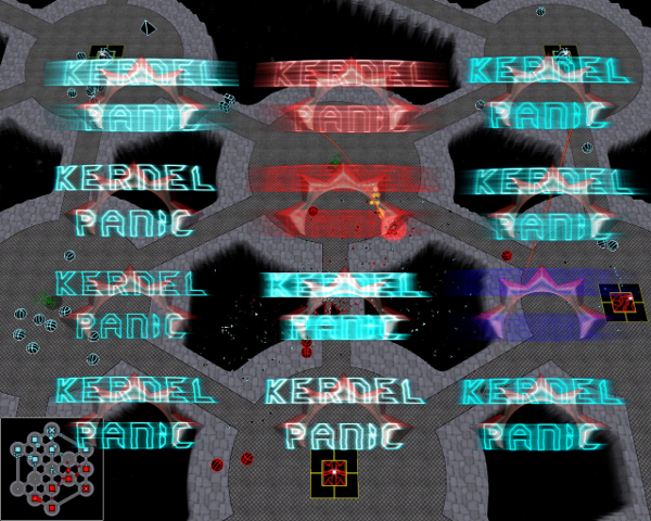
Screenshot background:
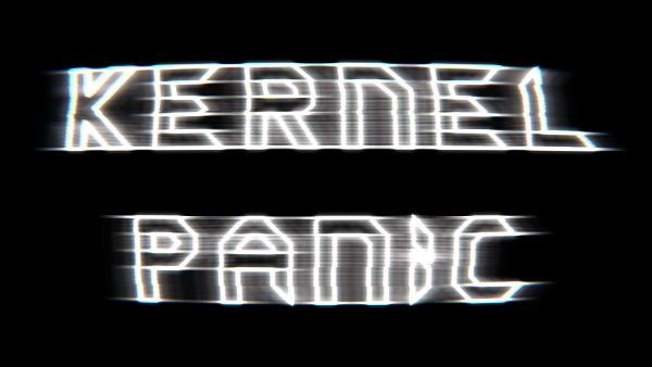
I also made reders without the Spring logo:
Black background:
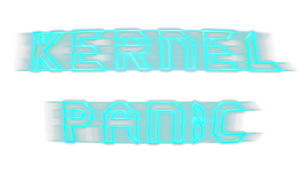
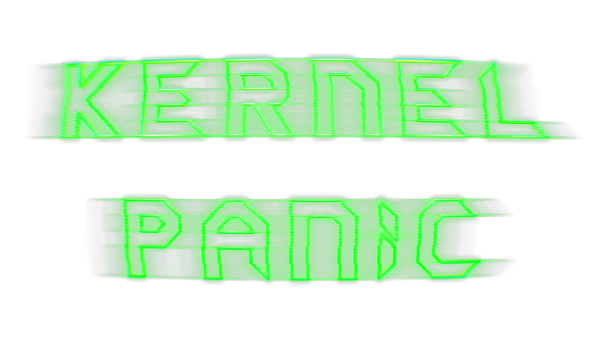
It's also possible to change the shape/intensety of the text:
Options, options. Now that I have a better grip on Blender I can really pull of some fun stuff. I could even animate it.. would take some time.
I also updated the Blend file to 2.5
Blender 2.57b file:
http://timblokdijk.nl/spring/Kernel%20P ... nel9.blend
The file is free to use for any purpose, but I do like to steal improvements so post your source (blend) file when your into that.


