Hi. I work in IT - the end that helps users find the "Any Key", among other things. I am a new player (~2 months) who played BA and then stopped because Spring stopped working (my problem was listed in the forums with a solution of "give up").
I installed a Linux Mint box at work to see people's reactions. I've watched people use it. I've watched people fail. I've done everything to make it easy for people, and I've had limited success. I've learned a bit about how people parse menus and other interfaces.
I just read this thread. Here is my advice - take it for what you will:
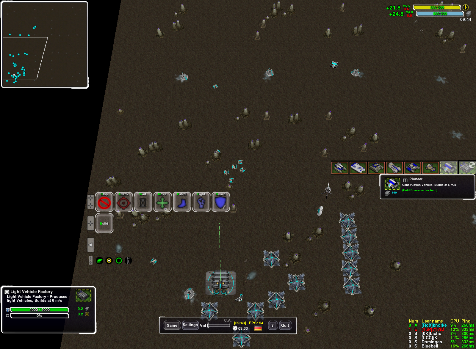
Unit Menus
Regret wrote:
This is a menu with sixteen buttons. Granted, only the commander has this many, but it is still unacceptable. The maximum number of menu items that people will readily put up with is around nine. The typical menu should have closer to four.
Yes, a person
can learn to navigate Start > All Programs > Microsoft Office > Outlook 2007, but he will have to
search for it every time. It is a serious obstacle the first few times, and a chore every time after that.
Five of these sixteen menu items have at least vague native meanings to a total newbie who has played an RTS before (Fire at Will, Hold Pos, Capture, Cloak, Stealth). These are fine, but having both Cloak AND Stealth will throw a lot of people for a loop.
Four are obvious after trying them once or twice (Ramp, Raise, Mex, Toggle Build Options). These are alright, though intuitive meanings would be nice.
The remaining seven are completely inscrutable unless explained externally or learned by dumb luck. The odds here are
bad.
The game doesn't have to be Fisher-Price's My First Game (TM) but it should be close. Nobody reads instruction manuals. Nobody reads tooltips. If a button can't explain itself, it will be unused. Worthless clutter. Corrosive, actually, because it intimidates new players and slows down everyone else.
The total number of menu items must be reduced. Removing a minor game-play mechanic for this purpose should be seriously considered.
Here are my specific suggestions:
- the Fire at Will toggle seems like it would be rarely used - remove it from all non-stealthy units
- the "Hold Pos" toggle should read "Stay". "Maneuver" and "Roam" are fine.
- Cloak and Stealth should be combined, or one removed entirely. Do you
really want players to have to learn the difference between the two?
- "Mex" should read "Mine". Don't use TA-specific lingo if possible. Change the name of the building itself to sync up with this, also. However, you could remove this button if you set the default action for a right-click on a metal spot to be "build a mex".
- "Toggle Build Options" should read "Show Build Menu". Fewer letters, simpler words. Hopefully, that button will be unnecessary someday.
- The terrain stuff is cute. I'd remove it. If you really must keep it, put it in a sub-menu, or restrict it to only T2+ builders. It currently dominates half of this bloated menu, when it might be seriously used twice in ten games.
- The priority button is cute. I'd remove it. Make it so that a project that isn't being actively built returns its resources with 100% efficiency as it degrades, so that players can put a project on hold with only wasted worker-time as a penalty.
- The Retreat-and-Ambulance mechanic is clumsy. Remove the Retreat button and build its functionality into the "Roam" setting. The destination for a retreating unit should be the nearest construction worker with a non-specific order (idle or patrolling), prefering workers that don't already have medical emergencies to deal with.
Build menus
BA has massive build menus. I almost gave up on the game without even trying, and I'm a Linux tinkerer! Hell, I
played OTA, and I still found these build menus imposing.
When I played a game of CA, I noticed that the aquatic forms of amphibious buildings are superimposed on the land versions - that is awesome. It is completely intuitive and saves lots of space. Still, the build menus have too much. This is why you have such trouble developing UIs that can give ready access to all the options.
There is no way around it:
cut some of the options. Find the redundant ones and eliminate them. "Redundant" means there is another already existing option that can substitute without significant loss of strategic decisions.
For example, in BA, wind generators are 100% redundant with basic solar. The decision to make one rather than the other is quite literally "Map X make wind, Map Y make solar". This is a stupid decision, not a strategic one, so one can safely be cut.
I've read that in CA, wind does better on hills. Even if this is the case, wind and solar are still redundant. There is a guessing-game for the height at which one surpasses the other, but other than that, the decision of which to make is always clear-cut once you have chosen the location. This is a stupid decision, not a strategic one.
However, the decision of
where to place generators
is a strategic one, balancing safety and convenience versus efficiency. Wind has this depth. Solar does not. Keep wind, cut solar. Tweak balance later.
I haven't played enough CA to suggest other cuts, so you are on your own. There will probably not be any obvious cuts. Every one will require an explanation of the same form as the above. Sometimes you will have to sacrifice a small but legitimate strategic decision. Sometimes you won't be sure. Take it slow, maybe discussing two units/buildings per week, with a final mod verdict at the end of every week.
This process is painful. People feel nostalgia for certain units and buildings. I feel nostalgia for certain units and buildings.
Somebody spent a whole summer of weekends writing the code to change terrain heights, and you are removing it AND the accompanying unit with the Free-Licensed model? Monster! Why do you hate freedom? It must be done.
I didn't start this thread. The menus are awful and you know it. Clutter is half the reason. I don't know the rest, but this is the cure for this half.