
Ok now I'm starting to think you have eye problems... If you meant red then that's understandable. Just take a look at the image you posted. If you did actually mean white on grey is difficult to read then you should really consider visiting the opticiansForboding Angel wrote:White on gray is very difficult to read
SpringFiles
Moderator: Moderators
Re: SpringFiles

Re: SpringFiles
Personally i also liked the white version. It was a radical design, white on black.
But the gray version is maybe a little cleaner. I don't think i am the one who decide which version it will be, white or dark.
I made a poll on the website so you decide.
But the gray version is maybe a little cleaner. I don't think i am the one who decide which version it will be, white or dark.
I made a poll on the website so you decide.

Re: SpringFiles
I disagree completely.
The White design was a visual travesty with that stupid connection between the menu and the page, it made no sense and destroyed visual balance.
This new one fixes that. Also yes the red text is hard to read, but then you shouldn't be using red text
The White design was a visual travesty with that stupid connection between the menu and the page, it made no sense and destroyed visual balance.
This new one fixes that. Also yes the red text is hard to read, but then you shouldn't be using red text
Re: SpringFiles
This.AF wrote:I disagree completely.
The White design was a visual travesty with that stupid connection between the menu and the page, it made no sense and destroyed visual balance.
This new one fixes that. Also yes the red text is hard to read, but then you shouldn't be using red text
Re: SpringFiles
And please, Can we shut up about White text on dark backgrounds being an unavoidable recipe for disaster? It just demonstrates an ignorance of typography. You can't swap the colours round and expect the same rules to apply, but you can make it just as effective by tweaking the font sizes, spacing and line heights. It's all to do with how the human eye perceives White text on dark differently to the same text dark on light.
-
Forboding Angel

- Evolution RTS Developer
- Posts: 14673
- Joined: 17 Nov 2005, 02:43
Re: SpringFiles
I used red because I expected the background to be white.
^^ spend 30 minutes on this site and then come back and tell me that your eyes don't hurt. It even uses giant font lettering to make reading easier, but is still much harder to read than a normal 10 - 12pt black font on white.
http://stackoverflow.com/questions/4986 ... th-effects
http://www.thebestpageintheuniverse.net/c.cgi?u=iphoneAF wrote:And please, Can we shut up about White text on dark backgrounds being an unavoidable recipe for disaster?.
^^ spend 30 minutes on this site and then come back and tell me that your eyes don't hurt. It even uses giant font lettering to make reading easier, but is still much harder to read than a normal 10 - 12pt black font on white.
http://stackoverflow.com/questions/4986 ... th-effects
I looked for published scientific research on your question. There's quite a lot out there, the trouble is technology has changed a lot and so for a lot of them it's unclear whether the research on television screens still applies. I found two recent papers which researched text on screen, both of them comparing white-on-black and black-on-white in experimental setups. Both of them found that black text on a white background is the most effective combination.
Hall and Hanna (2004) examined how colour combination affects readability and retention by experimenting on 186 test subjects. They found that both the readability scores (measured subjectively through a questionnaire) and the retention scores (measured through a quiz) were higher (i.e. better) when the text was displayed black on white as opposed to white on black.
Buchner and Baumgartner (2007) performed a similar experiment on 80 test subjects, except they measured the subject's performance on a proofreading task on a TFT display (Hall & Hanna did not mention the type of display they used). Buchner and Baumgartner arrived at a similar conclusion, with users consistently achieving higher proofreading scores when a black-on-white colour scheme was used.
So it appears that we can be quite sure in concluding that black-on-white text has been experimentally determined to be better for comprehension than white-on-black text when computer displays are involved. This is also backed up by a lot of older research on older monitors such as television screens.
However I should add that this does not eliminate the possibility that black-on-white still produces higher reader fatigue. If I find papers on that I'll let you know.
References:
Below I include links to the two papers I just described. I'm not sure how familiar you are with scientific journals, but sometimes authors are allowed to post draft versions on their websites, which, being draft versions, may have errors not present in the final versions. The problem being, of course, that you need to have a subscription to access the final versions. So that is why we make due with the freely-available versions of the papers.
RH Hall, P Hanna - "The Impact of Web Page Text-Background Color Combinations on Readability, Retention, Aesthetics, and Behavioral Intention" - Behaviour & Information Technology, 2004 - http://sigs.aisnet.org/sighci/bit04/BIT_Hall.pdf
A Buchner and N Baumgartner - "Text ÔÇô background polarity affects performance irrespective of ambient illumination and colour contrast" - Ergonomics, 2007 - http://www.psycho.uni-duesseldorf.de/ab ... larity.pdf
Visual fatigue research: Unfortunately I could not find very much research which measured computer screen visual fatigue in comparison to black-on-white text as opposed to white-on-black. The only piece I could find was a short reference in "Reading text from computer screens" by Mills and Weldon (1987) from the journal ACM Computing Surveys. Section 4.1 of that paper, titled "polarity", goes over important works at the time, including this piece:
I've tried hard to access the Cushman (1986) paper, titled "Reading from microfiche, a VDT, and the printed page: subjective fatigue and performance" in the journal Human Factors, but I cannot get it with my current subscriptions without paying $25. So I'm unable to tell you anything about the experimental setup of Cushman or whether his or her claims still apply today.In contrast to the results in these studies, Cushman [1986] found that subjects who read continuous text from positive contrast (light character) VDTs reported less visual fatigue (as measured on a subjective rating scale) than those who read from negative contrast (dark character) VDTs.
Even though Cushman appears to make the conclusion that a light-on-dark colour scheme actually induces less fatigue, I think there's one caveat to remember. Mills and Weldon also mention that back in those days, computer screens used a light-on-dark colour scheme because flicker was less apparent. It's possible that the flicker of the dark-on-light scheme was causing the visual fatigue. These days, monitors don't flicker (as much), and so the claim probably still does not hold. This makes me question whether flicker is actually the true primary cause of computer screen visual fatigue, maybe I should look into this.
Another interesting point, Mills and Weldon also say black-on-white text on paper is more readable "due primarily to the larger number of eye fixations required to read white print on a black background," for which they cite a paper by Taylor (1936) called "The relative legibility of black and white print" in the Journal of Educational Psychology. So if we presume that the same reason applies to computer screens, then that is the root cause for all of this contrast polarity readability business! It's all because of eye fixations.
Re: SpringFiles
You used red for emphasis. Writing your copy correctly would have avoided this, as would have putting it under a subheading and expanding appropriately, as would using bold. Instead you reduced the effectiveness, and invoked the 'I see adverts, I no read this' syndrome.I used red because I expected the background to be white.
A straight forward reversal of colours will always lead to a reduction in readability, because it is ignorant of what exactly happens.
http://www.markboulton.co.uk/journal/co ... typography
Also bear in mind that the first site you linked to would induce just as many headache in black on white, as it is a horrendous site to use for typography. It's like painting a Cow pat pink and using it as justification that pink is a bad colour to use regardless of use or context.When reversing colour out, eg white text on black, make sure you increase the leading, tracking and decrease your font-weight. This applies to all widths of Measure. White text on a black background is a higher contrast to the opposite, so the letterforms need to be wider apart, lighter in weight and have more space between the lines.
Simply making text bigger does no make it more readable, nor does making it bolder. If anything they can make it harder.
Here are some Dos and Donts of Dark web design:
http://www.webdesignerdepot.com/2009/08 ... eb-design/
Liberal whitespace ( blackspace? ), dont use pure black and pure white other than for emphasis, tight copy is bad but you can get away with it on white backgrounds so spread out more for dark, simplify colour schemes so they don't look busy.
I would also add that dark backgrounds make the colour in photographs 'pop', so make good use of that effect.
Why Spring Files Dark on Light is BETTER than what it used to have
- It wasn't actually dark on light, it was an unholy mishmash
- This destroyed visual balance
- The huge white block made it hard to read text in the menus, dramatically reducing the effectiveness of menus
- The darker areas including the logo, search bar, etc, effectively became a frame to the large white block.
- Contrast in non-white areas became negligible, inducing low contrast text syndrome
- The light grays used in the menu bars are too light, and result in distraction and low contrast menu text. I reccomend halving their brightness and keeping the text the same lightness
- Increase margins underneath advert banners and between blocks vertically
- In some places, the highlighted boxes in light gray would stand out more and be more readable if they took on a darker not a lighter shade, with a thin border 1 shade lighter to keep the two boxes separate.
- Use #fafafa or #f0f0f0 instead of #ffffff for text colour. Contrast is too high in some places. Consider using full white for bolded emphasised text.
- A non-standard logo aka a 'faux-go' is being used ont he main spring engine page.
- Green Headings do not line up with their dividers, remove the left hand padding
- Some articles include span elements that force the text colour to black on a black background
- Rename Mods and Maps to reflect the official policy change on Mods vs Games
- More margin between rows on listings
- Darker listings backgrounds
- Date cells do not respect the alternate styling of rows in listings
- Consider adding Verdana ahead of Arial/helvetica in your font stack
- Increase line height from 1.333em to 1.6em
- Remove the margin/padding on the div container containing the comment box
- When using a light background, with a lighter box on top, consider putting a border around the edge of that box that is 1 shade darker than than the darker background it sits on
Re: SpringFiles
Thanks for your recommendations!AF wrote:done
- The light grays used in the menu bars are too light, and result in distraction and low contrast menu text. I reccomend halving their brightness and keeping the text the same lightness
done- Increase margins underneath advert banners and between blocks vertically
done- In some places, the highlighted boxes in light gray would stand out more and be more readable if they took on a darker not a lighter shade, with a thin border 1 shade lighter to keep the two boxes separate.
done, except for the description field, cannot use a dark background, since some articles have black text hardcoded in it- Use #fafafa or #f0f0f0 instead of #ffffff for text colour. Contrast is too high in some places. Consider using full white for bolded emphasised text.
done- A non-standard logo aka a 'faux-go' is being used ont he main spring engine page.
will change that- Green Headings do not line up with their dividers, remove the left hand padding
done- Some articles include span elements that force the text colour to black on a black background
it's hardcoded, made with a WYSIWYG editor- Rename Mods and Maps to reflect the official policy change on Mods vs Games
It's a general menu, not just for Spring- More margin between rows on listings
that looks silly in most cases.- Darker listings backgrounds
done- Date cells do not respect the alternate styling of rows in listings
- Consider adding Verdana ahead of Arial/helvetica in your font stack
done- Increase line height from 1.333em to 1.6em
that's really too much, i've raised it a little- Remove the margin/padding on the div container containing the comment box
done- When using a light background, with a lighter box on top, consider putting a border around the edge of that box that is 1 shade darker than than the darker background it sits on
Last edited by jj on 05 Sep 2011, 22:09, edited 2 times in total.
Re: SpringFiles
Wow I haven't seen that in a while. AF posts some good pointers and definitive points for improvement, JJ follows them up instantly and site looks a lot better for it. Nice job guys ^_^
Before, when it was white, it just looked kind of unfinished to me. As if you were half way through it and just stopped. But now, now this is a site design I can appreciate again
Glad you decided to use my logo as the static logo, although, I do kind of miss the old random rotator. If you like, I can make a bunch of logos like the current one with units in the corners or w/e so there's some actual consistency and you can just use those or the ones you like?
Re: SpringFiles
Yes, the old logo rotator was fun! About the logo's i really like your logo's but i don't have the PSD file of it anymore.Jazcash wrote: Glad you decided to use my logo as the static logo, although, I do kind of miss the old random rotator. If you like, I can make a bunch of logos like the current one with units in the corners or w/e so there's some actual consistency and you can just use those or the ones you like?
My girlfriend is a graphics designer and she wants to design a new logo for SF.
Maybe you could provide her with some images to use in the logo.
That would be nice!
Re: SpringFiles
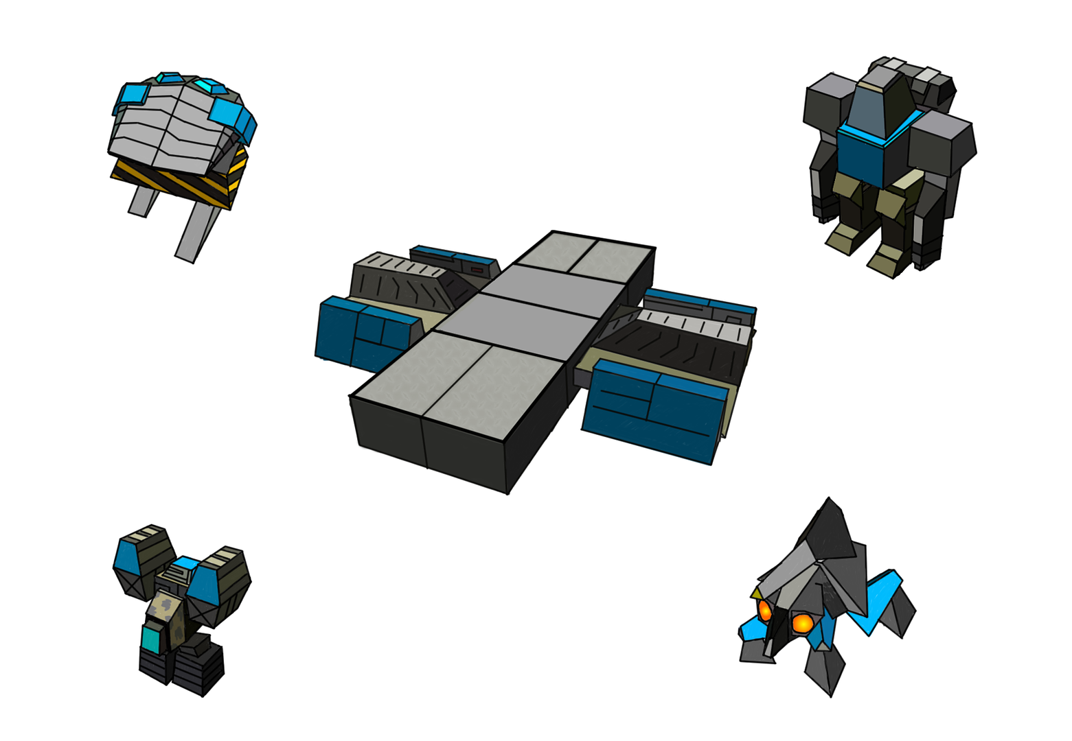
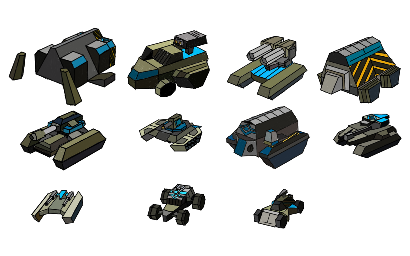
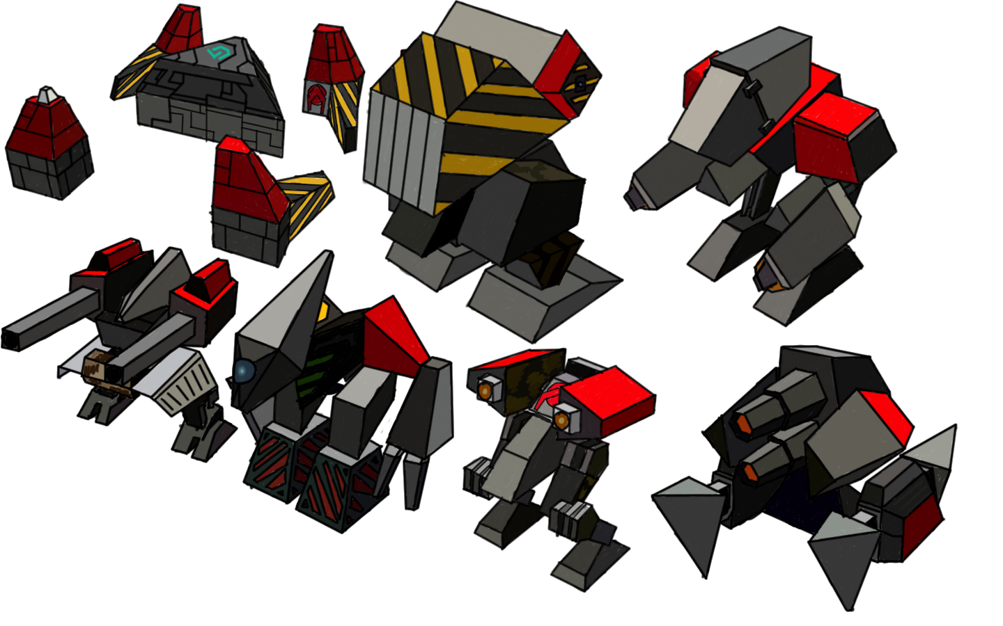
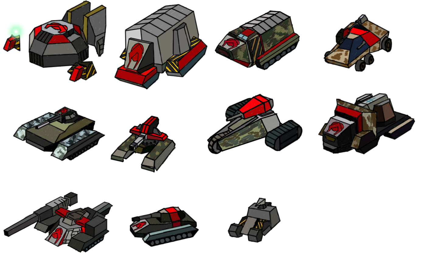
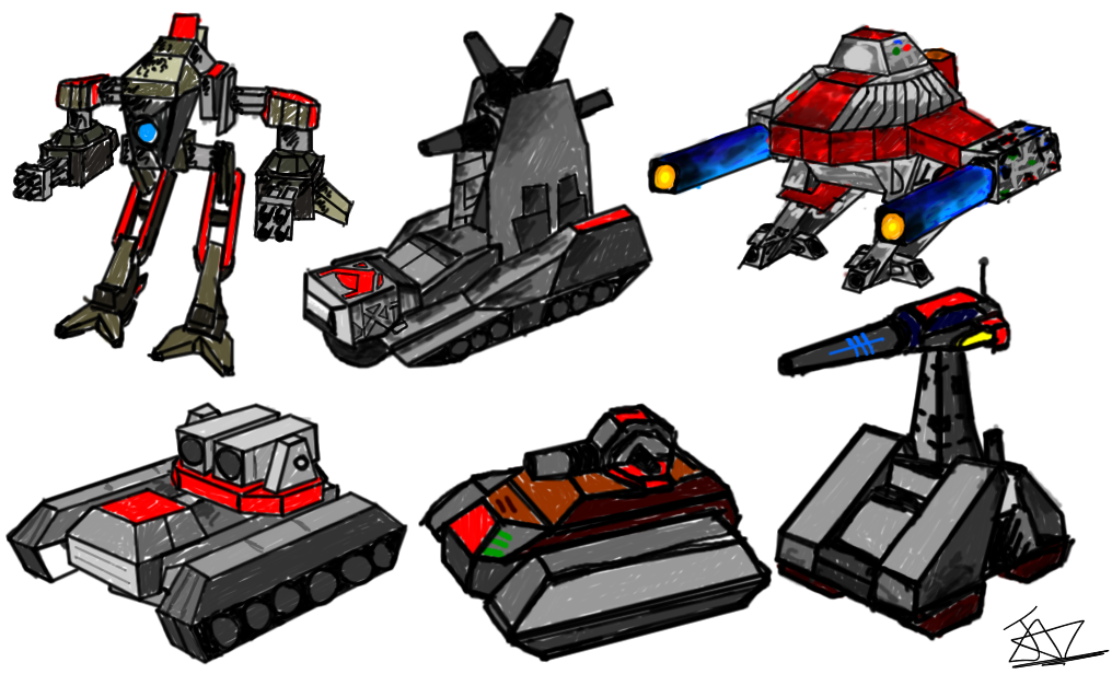
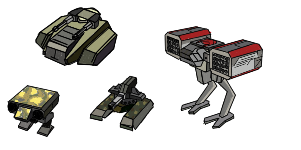
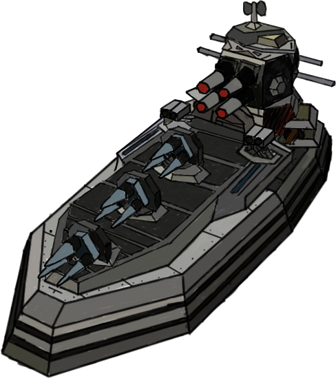
I've mentioned this before but just in case you or anybody else missed it, the following images are free for anybody to use for any purpose. Profit/non-profit, anything. They're just BA units I traced and coloured about 2 or 3 years ago when I was trying to get used to my graphics tablet. Your gf can chop up and resize some of those if she wants, I quite like the feel they give but I won't be hurt if you don't wanna use 'em so don't worryjj wrote:Yes, the old logo rotator was fun! About the logo's i really like your logo's but i don't have the PSD file of it anymore.Jazcash wrote: Glad you decided to use my logo as the static logo, although, I do kind of miss the old random rotator. If you like, I can make a bunch of logos like the current one with units in the corners or w/e so there's some actual consistency and you can just use those or the ones you like?
My girlfriend is a graphics designer and she wants to design a new logo for SF.
Maybe you could provide her with some images to use in the logo.
That would be nice!
http://i141.photobucket.com/albums/r51/ ... botsT1.png
http://i141.photobucket.com/albums/r51/ ... clesT1.png
http://i141.photobucket.com/albums/r51/ ... botsT1.png
http://i141.photobucket.com/albums/r51/ ... clesT1.png
http://i141.photobucket.com/albums/r51/ ... awings.png
http://i141.photobucket.com/albums/r51/ ... ncepts.png
http://i141.photobucket.com/albums/r51/ ... awing2.png
http://i141.photobucket.com/albums/r51/ ... /Epoch.png
http://i141.photobucket.com/albums/r51/ ... awings.png
If you want any unit specially drawn up I'll be happy to. Just the one though, it gets a bit boring after a while

Re: SpringFiles
watPoll:
Do you know the game Spring?
Re: SpringFiles
Since more then 50% of the site visitors are non-spring players (visiting the site for the other games around there), i thought a poll like this would give some attention to Springknorke wrote:watPoll:
Do you know the game Spring?
PS. if you got good poll idea's let me know..

Re: SpringFiles
White or black?jj wrote:Since more then 50% of the site visitors are non-spring players (visiting the site for the other games around there), i thought a poll like this would give some attention to Springknorke wrote:watPoll:
Do you know the game Spring?
PS. if you got good poll idea's let me know..
I'm talking about the site colors, you damned racists
Re: SpringFiles
I mean how Spring is the name of the engine and various games (not: mods) run on it.
You can not really "play the game Spring."
Not how much you read the forum but there was much drama about that ("Spring=BA" and all that)
Also while those units pictures are nice it would be good to have some non-TA units.
Do not have a good idea for poll right now.
You can not really "play the game Spring."
Not how much you read the forum but there was much drama about that ("Spring=BA" and all that)
Also while those units pictures are nice it would be good to have some non-TA units.
Do not have a good idea for poll right now.

Re: SpringFiles
yeah... why always the units with their guns?
We also have bush, mushroom and whatnot. gotta be good to attract players too, right?
We also have bush, mushroom and whatnot. gotta be good to attract players too, right?
Re: SpringFiles
Thanks for the fast updates JJ =] Things are looking much better

Re: SpringFiles
Hi jj,
I think springfiles works great, I understand there must be other games there too, but other than that, when you find a specific mod or map, the page functionality is terrific.
One question though: how do you add a design-,metal- and heightmap to a map's page? I can find no dialog button for it on the edit page, is this done automatically by springfiles by scanning the .sd7-file?
Re: SpringFiles
What's terrific about the page functionality?
The design, metal- and height-map is scanned automatically by SpringFiles.
No action required. However, i have to investigate why it takes so much time before those previews are available.
The design, metal- and height-map is scanned automatically by SpringFiles.
No action required. However, i have to investigate why it takes so much time before those previews are available.